Rebuilding our mobile website: Express & React meet fun & profit
Late last year we decided to give our mobile website a new look, coupled with a new “engine” in order to optimize our mobile experience on the web. Most of our users visit Namshi from mobile devices and we wanted to give them better usability, performance and overall smoother experience.
When we started approaching the mobile landscape, 4 years back, we decided to fully commit to an SPA that worked well but showed some limitations, namely the inability to perform server-side rendering, which was somewhat critical in terms of search engine optimization and first render: we solved the former by routing bots’ traffic to our desktop website (a traditional server-side app), but the latter proved hard to solve, as the client would have to download our entire app before being able to understand what page and layout it should render. In the meantime, Google decided to roll the “mobile-friendly” badge on their mobile SERPs, which forced us to look for alternatives.
A year and a half down the line, facing mixed results in terms of conversion rate and usability, we decided to review our implementation and build a small isomorphic app that would be able to render both on the client and the server, but this approach had 2 major flaws: first off, we didn’t look at neither our UX nor UI to figure out if there was anything we could do to make the user’s experience better and, second, we over-engineered our stack. Back then React just started garnering attention and, unsure if that would be the way the community would build “frontend” apps 3/5 years later, we decided to write a very small custom-made isomorphic framework that turned way more complicated than we originally thought.
At Namshi, we’re very big on simplicity and “back to the basics” but, as you see, that’s also thanks to lessons we learned the hard way.
Flash-forward to Q4 2016, we looked at our mobile website and our metrics combined and decided it was time to completely re-think our approach: 2 of our engineers quickly hacked together a prototype within less than a week and, after discussing it with our PM team, we decided it was worth a shot.
The Falafel Project was born. Sounds like a joke but that’s what we actually called it :)
Fundamental ideas
The project kicked off by embracing 3 very important ideas:
- most of Namshi’s traffic is served through our mobile apps (iOS + Android). We should probably mimic the app as much as possible.
- The journey of the user is defined by very few, key components: landing pages, product listing pages, product detail pages, cart and checkout. We want to make sure we waste no time presenting these pages to the user, and server-side rendering gives that to us
- If we want this webapp to look like it’s 2017, client-side interactions are unavoidable: picking React, given its rise in the frontend community and the fact that it’s a library, rather than a framework, was a no-brainer

Re-writing the styles
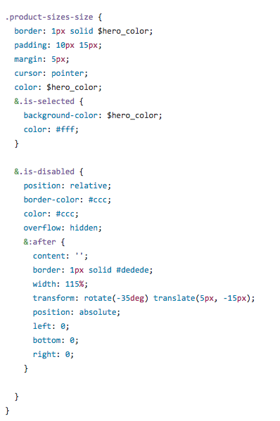
We trashed the old css and rewrote it from scratch following the BEM way of doing things, which allowed us to separate styles per page and also have some of them shared between pages. The total size of the minified styles was 18kb, now it is 10kb: almost half of our css is gone!
RTL styles
It’s always painful to handle direction in css, especially considering that things could have been much easier if logical properties where introduced, but yet we still use the old techniques until we can fully dump rules overriding.
For example:
/**
 flex-start, flex-end logical properties will change according to the
 direction: rtl : ltr;
**/
.element {
 display: flex;
 align-items: flex-start;
 justify:-content: flex-start;
}
/**
 opposite to: text-align, css-transforms, floats, margins, paddings ..etc
 which we need to override manually.
**/
We kept the arabic styles in separate files, i.e list.scss / list-rtl.scss where the *-rtls.scss will only override rules in the main file.
That worked for us really well and was a substantial increase in code maintainability.
Enhanced UX leveraging on mobile browsers
We took a decision to ditch SPAs in favor of lightning-fast server-side rendered pages.
Despite that, we took advantage of a very interesting feature on modern mobile browsers: if you tap on a link, they kinda fade the newly painted page over it so if there are common visual components you won’t feel the page load.
Strange, right? Have a look:
So how we can use it for our own good? We came up with idea of a “Shadow Product”: When a user taps on a product while on the catalog listing page, we delay the tap event for 10ms and we show a fake preview of what the next product page will look like. Simple and dirty, but looks great!
on('click', 'body', '.is-shadow-product', e => {
 .... code that extracts content from clicked product
 this.setState({ data: data, show: true });
 setTimeout(function () {
   window.location.href = href;
 }, 10);
})
The problem with this approach is that we need to handle the back-forward cache of some browsers:
// Prevent backforward cache in iOS devices
if(config.get('deviceOS') === 'iOS'){
  window.addEventListener('pagehide', function(e) {
    let shadowProduct = document.querySelector('.is-transitional');
    shadowProduct && shadowProduct.classList.remove('is-transitional');
  });
}
NO jQuery
Late, but we eventually joined the party! We stripped jQuery off 80% of our pages and we replaced with some vanilla utilities like the following:
- On :
  export function on(eventType, parent, selector, fn){
    let el = document.querySelector(parent);
    if(!el || !eventType || !selectorParent || !selector  || !fn ) {
      return null;
    }

    el.addEventListener(eventType, function(e) {
     .... logic to target the child on the event bubbling.
   })
  }, false);
- Scroll to, Scroll To Top and Scroll To Bottom:
function animateScroll() {
  var step = (dest - parent.scrollTop) /  steps--;
  parent.scrollTop = parent.scrollTop + step;
  if(steps === 0 ){
    frame &&  cancelAnimationFrame && cancelAnimationFrame(frame);
    return
  }
 frame = requestAnimationFrame &&
 requestAnimationFrame(animateScroll);
}- Image Carousel:
We crafted our own slider (read the full story here):

Low Fat React: Preact!
Though we chose SSR, we were not building a static news website. You can imagine how much client side interactions an E-commerce mobile website has. Our previous mobile website was a tailor made isomorphic app, and we had lot of lessons learned from it. Moreover, performance was a key focus area for our new website, hence we kept some design decisions for all the client-side stuff. These includes:
- Our website should be interactive under 5s.
- Should have a great rendering performance. Animations and transitions should be ~60FPS.
- Total client-side scripts should be less than 100KB ( including any frameworks / library ).
- Build re-usable client-side components.
By considering all the above, we wanted something lightweight and with good rendering performance.
We initially ruled jQuery out of the list and thought of creating all client-side components in vanilla js, however, we found that managing the UI state was bit hard with that approach. Moreover, we really liked the redux architecture and keeping a single store for managing the whole UI state.
React was the hottest choice for our expectations but, at the same time, we wanted a lightweight library. Then we came across Preact, a 3KB React alternative which offered the same API and great performance.
We built most of our components in Preact and re-used them across pages. Although we liked the redux architecture, we didn’t really use Redux on our website. Instead, we built a micro-redux which has a global store for managing the whole UI state and is connected to all Preact components. This helped us to manage the UI state in a single store and synchronizing updates in every part of the page.
Simplifying the DOM states
Managing state is one of the crucial parts of “react like” development, especially state shared between components (Shared State) can be difficult to manage. We have good libraries that achieves this efficiently — ie. Redux and Mobx that we use on some of our SPAs.
In the new mobile website, our approach is a bit different because each page is SSR and we have very less shared state: we try to reduce client-side code to the minimum, to keep things simple and less bloated.
We have one store which is the single source of truth. To keep things simple every component has it own actions as part of the component, and we only focus on resolving all data into the store and the store automatically updates the state of the components. Unlike most redux implementations, where reducers are used to update the current state based on the actions, every update always produces a “next state“ without reference to the current state.
Webpack, Code splitting and Preloading techniques
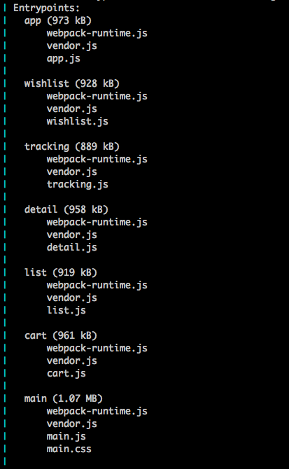
Code splitting: eat only what you need
Code splitting was a crucial part for our website. Traditionally, we used to bundle all our JavaScript assets into one single file, and loaded it in every page. At that time it was a very performance-friendly approach, as the browser gets all the assets with a single HTTP request.
With HTTP2, things changed — multiple round-trips are avoided by channelling multiple requests through a single connection. Knowing this, sending a large bundle (which includes code that’s not needed in the current page) would negatively impact the page’s performance so we decided to split our code based on the routes ( different pages ).
We chose Webpack2 for bundling and code-splitting. As we said earlier, we generate js bundles ( aka chunks in webpack terminology ) for each page. We used Webpack’s CommonsChunkPlugin to generate a vendor bundle and common code shared between the page level bundles. This helped us to keep smallest JavaScript payload for each page. Furthermore, the vendor chunk and common chunk will change less frequently and can be cached by the browser for most requests, enabling faster transitions between pages.
Reduce bundling and nested dependencies
Webpack2 supports Tree-shaking out of the box, which helped us reduce the bundle size by ~20% by only including the required modules.
For example, we used some lodash utilities in our client-side code. Without Tree-shaking, the whole of lodash would have been imported into our bundles, thus the size would’ve been much bigger. Webpack2 will instead generate the bundle only with the code that’s actually used.
Preload, Prefetch
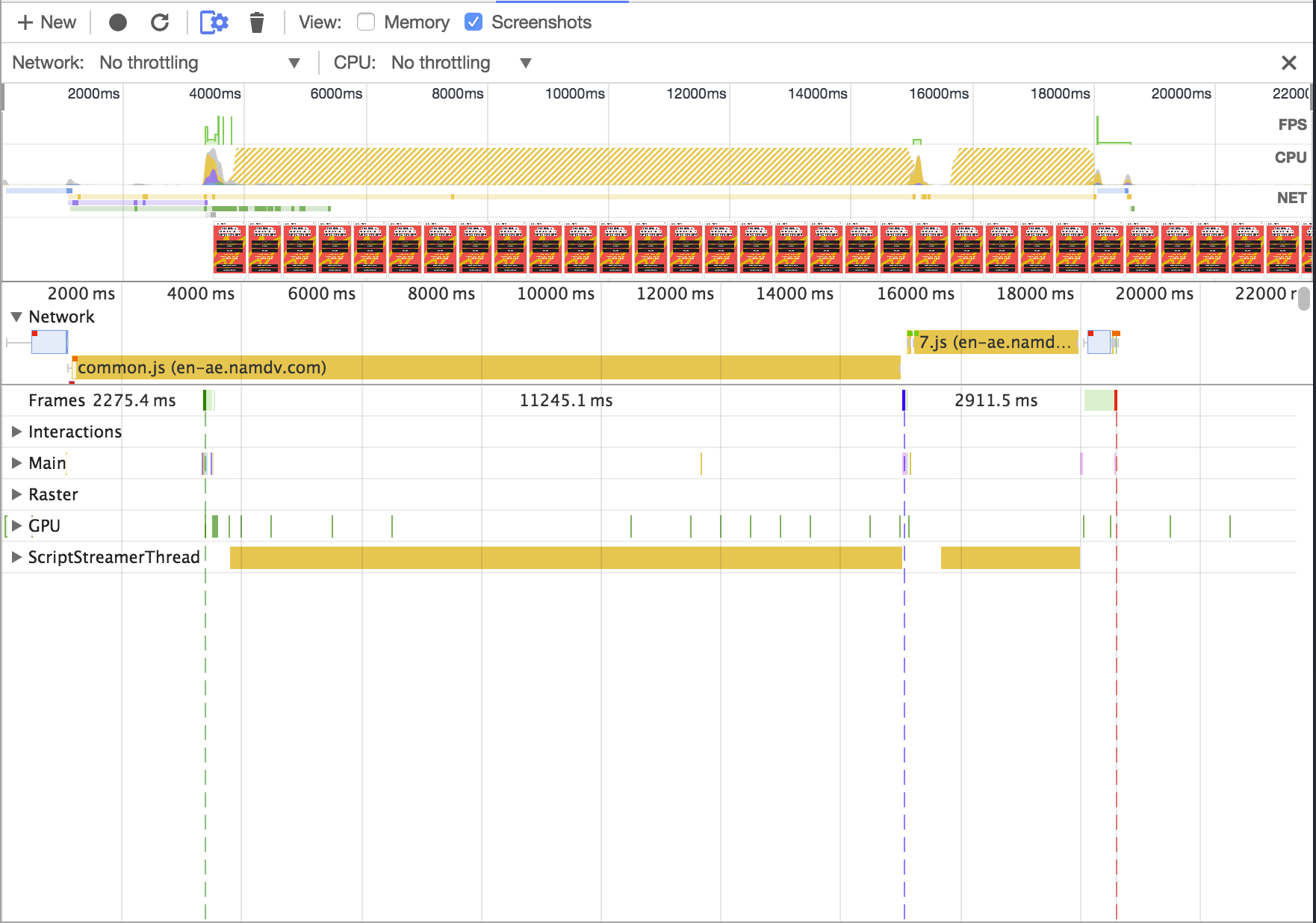
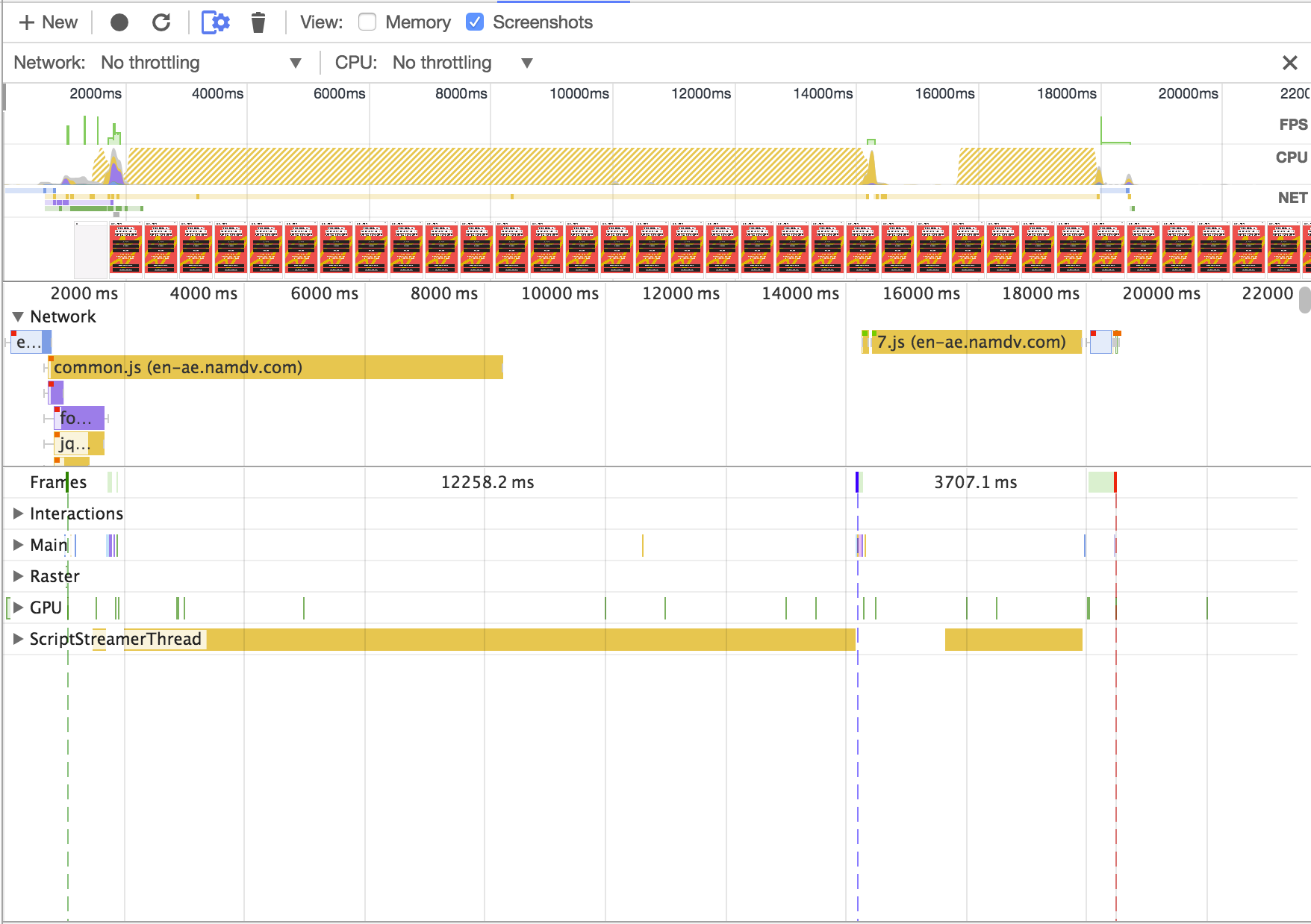
We also took advantage of the latest browser features for attaining better page load speed. These includes the dns-prefetch for prefetching for resolving domain names, link-preload for loading the CSS and JS assets at the same time HTML is parsed. We also used link-prerender in our catalog listing page pagination to make the transition between pagination much faster.
Notice the Green Line ( which indicates the first paint ):
Before
After
Goodbye good old image sprites
Thanks to HTTP/2, making HTTP requests is cheaper than ever: multiplexing reduces the connection overhead as multiple requests can be tunneled through the same connections, and extended header compression (HPACK) makes it so that those requests are lighter than ever.
This doesn’t mean sprites won’t give you any advantage: as always, making 10 HTTP requests instead of 1 is generally heavier, but with HTTP/2 you don’t “feel” it as much. Another argument pro sprites is that by combining images together we end up allowing the compression algorithm (ie. GZIP/DEFLATE) to better optimize the size of the final, combined image.
All in all, though, we eventually decided not to worry about these and live a less complicated life because:
- We generally bundle all required images into one sprite, whereas each page might just need 2/3 of them: this means that instead of downloading 100% of your images on the first page load we only require 20/30% of them
- Maintaining sprites is no fun at all: if there’s a way to eliminate work and be on par with our previous implementation, then we’re definitely going to cut it short
Results
Numbers, since we went live in mid-February, have been astounding. Even though web traffic is a small chunk of our overall traffic, it’s been way better than we could ever imagine:
- conversion rate is up ~20%, meaning that the overall shopping experience is smoother (worth to note that some of the countries we serve have spikes in conversion of +30/70%)
- bounce rate is down 15%, which indicates that our first impression (load time, UI, etc) has definitely improved
- the average time on page is up 50%, and the average session duration up 37%, meaning users enjoy spending time on the site way more than before
- the average document load time & average document interactive time are both down 54% (4+ seconds vs 1.9), which means that… …well, we really screwed it up with the previous app :)
Take this numbers with a pinch of salt, as we mentioned in the introduction of this article, we started from a very disadvantageous point — the performance of the old mobile website was quite disappointing — and, at the same time, Namshi grows and optimizes on a daily basis, so better numbers are expected regardless.
Last but not least, one for the server-side freaks. In this article, we spoke a lot about frontend optimizations and the likes, but I want to share an image to show the performance of our server-side rendering process:
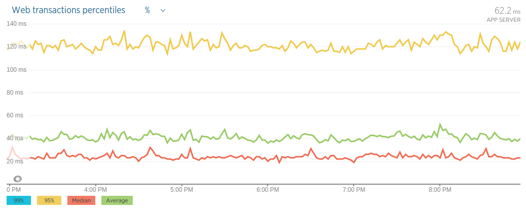
As you see, our average response time is around 40ms — but you shouldn’t care, as averages make for a terrible KPI.
Percentiles are really what you want to look at:
- the median is at around 25ms, meaning half of our requests are served within that time
- the 95th percentile is at around 120ms, which is still incredibly great, considering that the website fetches the data it displays from an internal API, and that involves an external HTTP call
See you next time!
This article is a joint effort between the 3 frontend musketeers of Namshi: Shidhin, Amin and Gabriel.